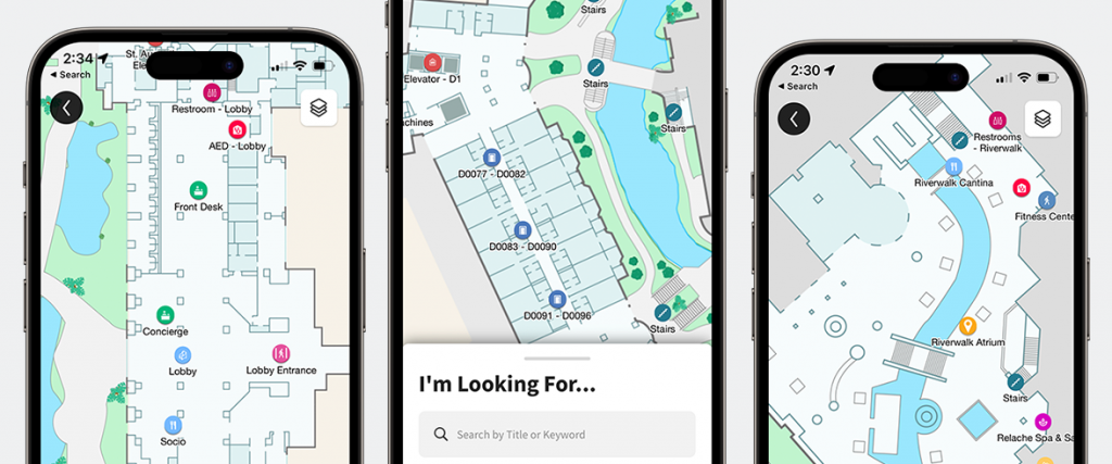
Phunware’s Location Based Services (LBS) module offers a comprehensive set of tools that enables brands to light up on-premise experiences and provide memorable engagement for visitors, such as navigation, location sharing, and more within your facility.
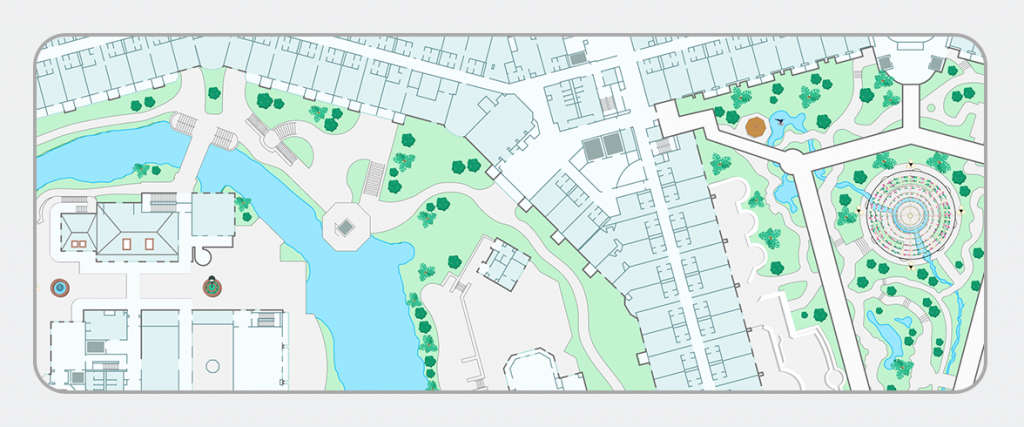
When designing a map to help users find their way around a campus or complex facility, it’s best to keep in mind what elements are most important for the user to see, and help them focus on the task at hand: finding their way.
Keep it Simple
When introducing a user to an interface, you should be mindful of the user’s cognitive load, which is the amount of information a person’s mind can take in at one time; if you present the user with too much information to process all at once, it can slow down their ability to complete their task and make it appear more difficult.
With established modern UX patterns across wayfinding with popular apps like Apple Maps or Google Maps, it’s important to keep the user experience familiar, while guiding users through their experience. In map design, it’s best to keep the map itself simple and neutral, to provide the user a base layer of information in orienting – and place focus on the wayfinding UI like the route line, points of interest, or the animated blue dot.
Only Important Details
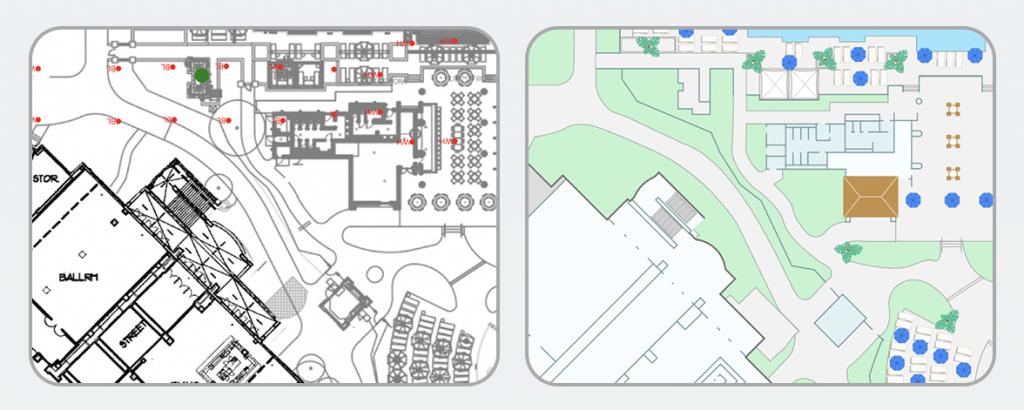
When designing the map, it’s best to consider what visual elements of the map layout would be most beneficial for the user to notice while they are finding their way around the facility. Key landmarks, notable walkways, and clearly marked exits and entrances can all be useful elements that make up the map. Other details like interior rooms, complex furniture arrangements, or patterns on the floor may provide more detail than is needed.
Do Not Distract
There are a lot of potential design elements that could be used in map design, but should only be used as needed – and each element should be thoughtfully considered when looking at the mapping experience as a whole. Flashy visualizations like 3D maps or heavy use of branding and saturated colors can actually harm the user experience, requiring a high cognitive load of the user, which could actually overwhelm them, or require additional time for the user to sift through which elements are most important.
Let Us Guide You!
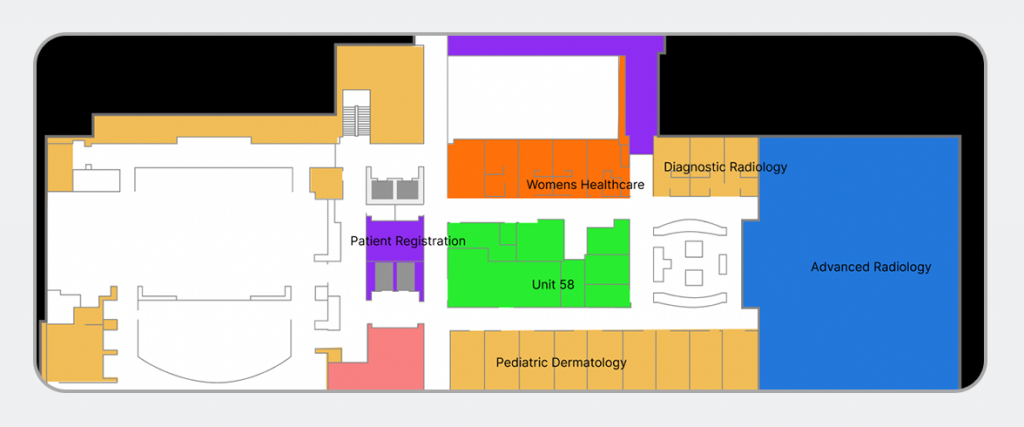
Our design team will work with you to help translate complex floor plans into beautifully simple and user-friendly map designs. We’ll work with you to identify the most important areas of the map to focus on, which landmarks or exterior areas are best to illustrate, and what level of detail is ideal for your visitors. Additionally, our designers will help you in extending your brand to the map design, while keeping in mind the above best practices to deliver a perfect map design for your facility.
Chat with us today to discover how we can help you create an unforgettable experience for your visitors!


